


Power Serums
These three new serums were the first products launched under Skinstitut’s refreshed brand and packaging. Formulated to deliver anti-ageing, hydrating and brightening benefits, the creative needed to reflect this targeted approach and make it easy for customers to identify which serum is which.
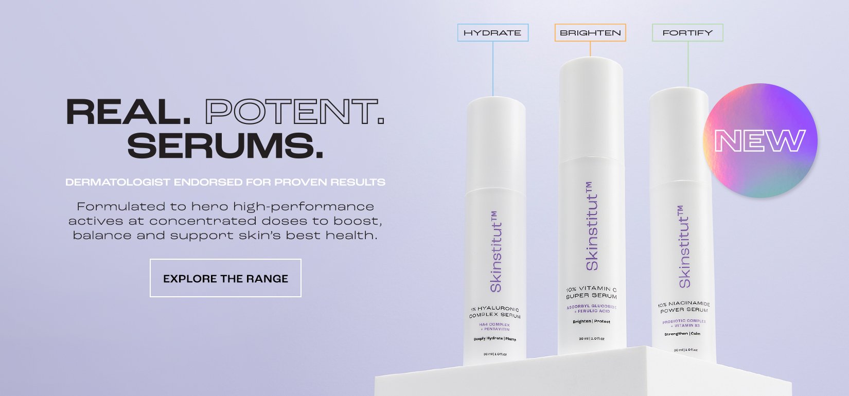
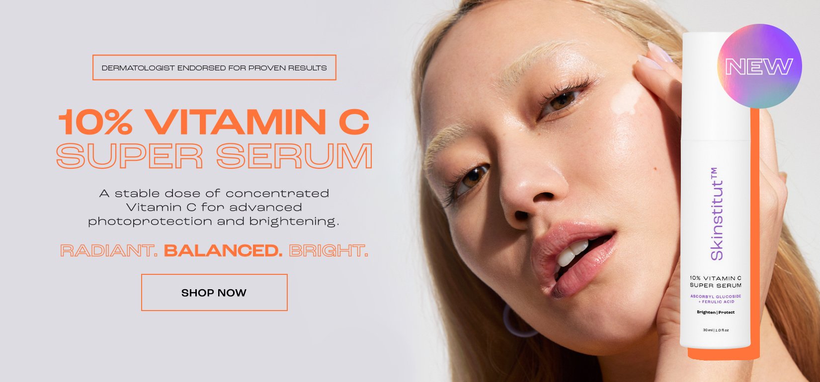
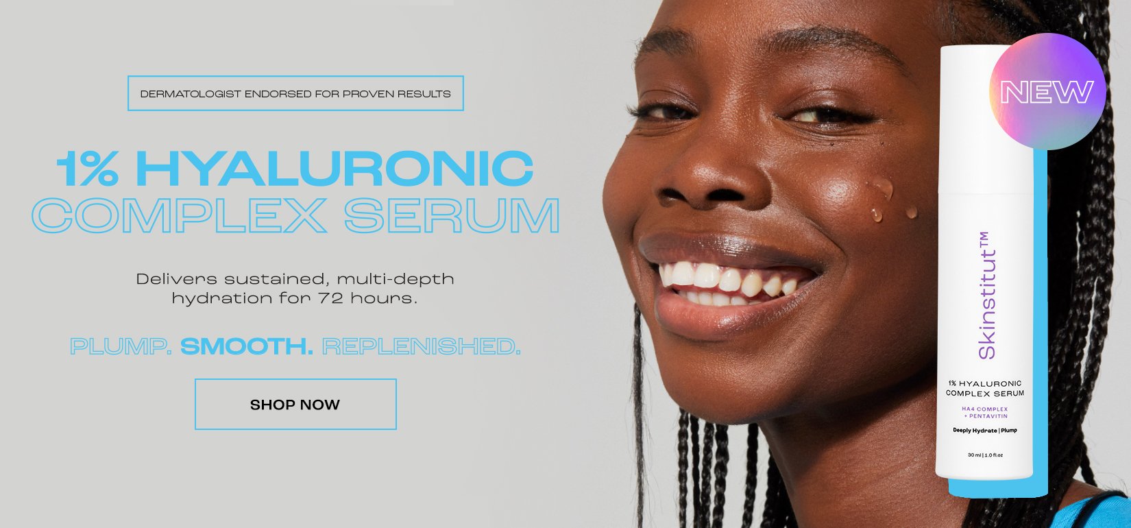
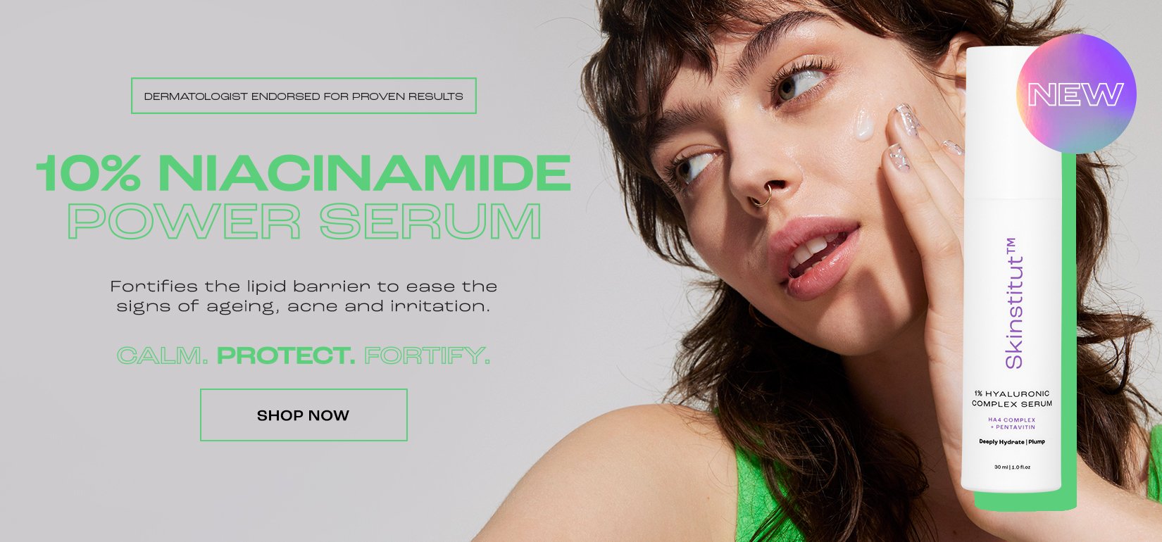
Using talent imagery and Skinstitut’s skin concern colour labelling system, each of the three serums is identified by their hero colour – orange, blue or green – and a specific model. This helps customers easily distinguish between the three serums and recognise their key benefits.


Packaging
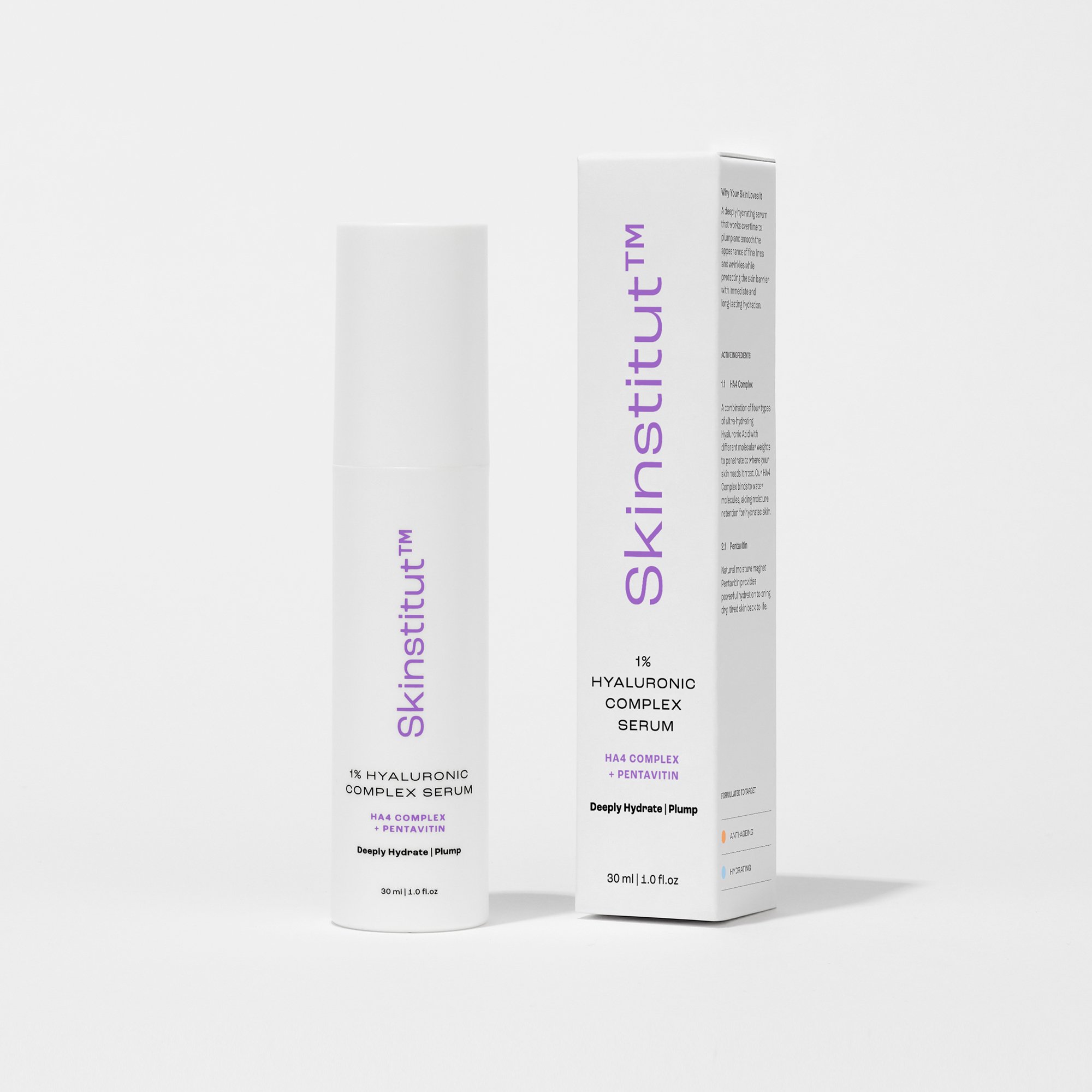
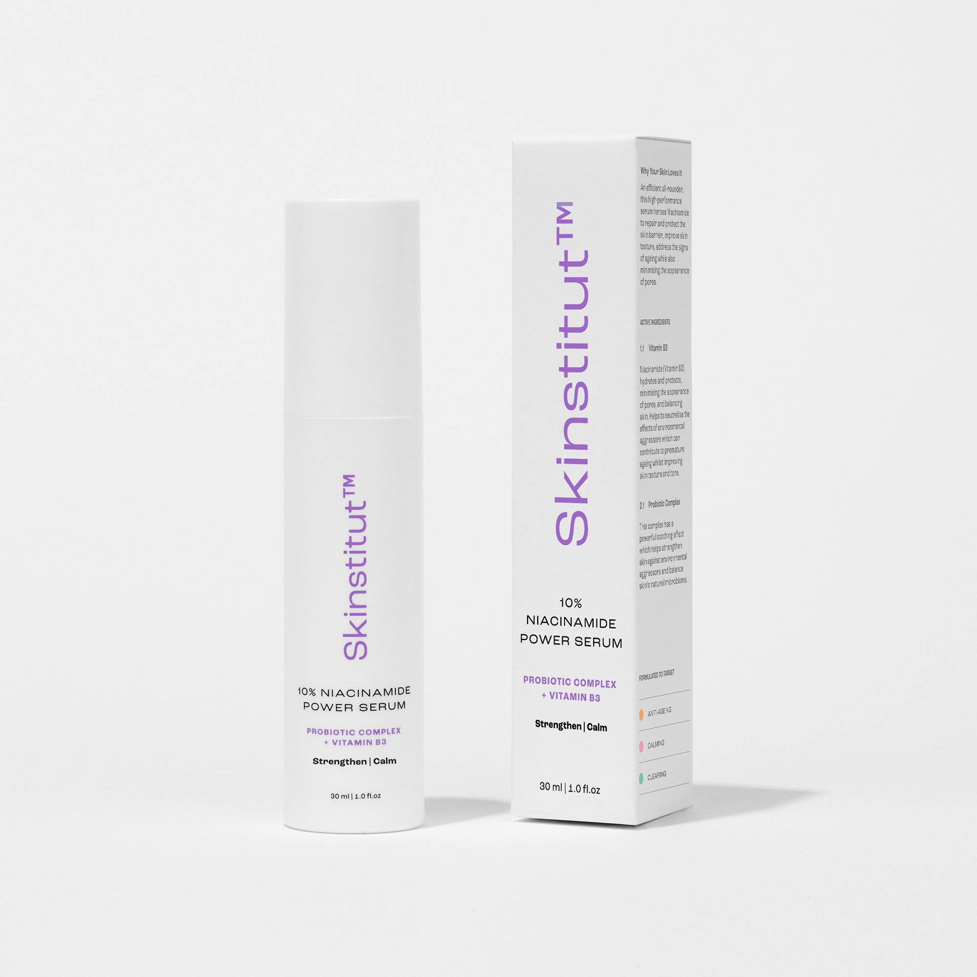
These ultra-premium serums were the first products to go to market after the full Skinstitut rebrand. Their packaging design was crucial to the rollout of the rest of the new packaging.

Point Of Sale
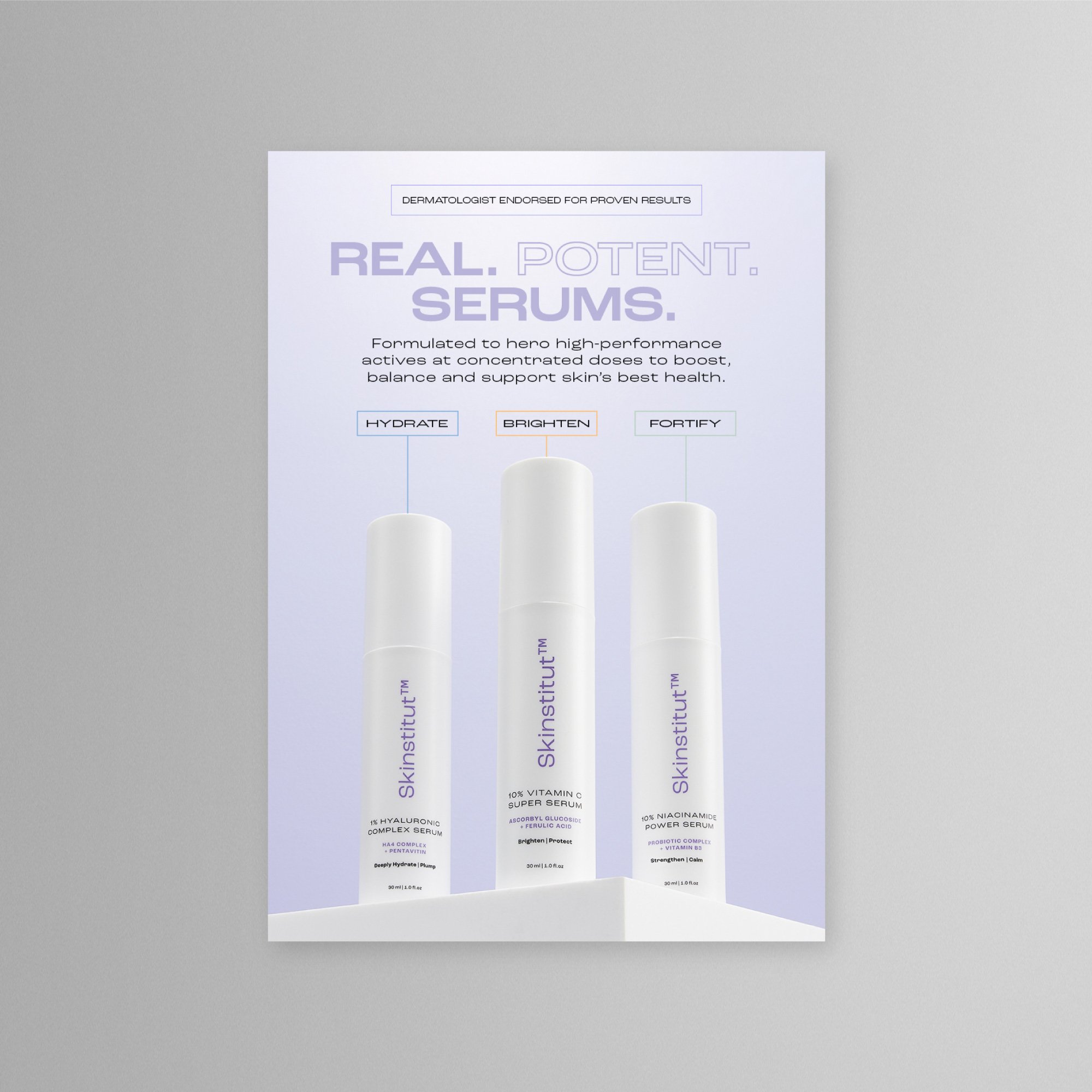
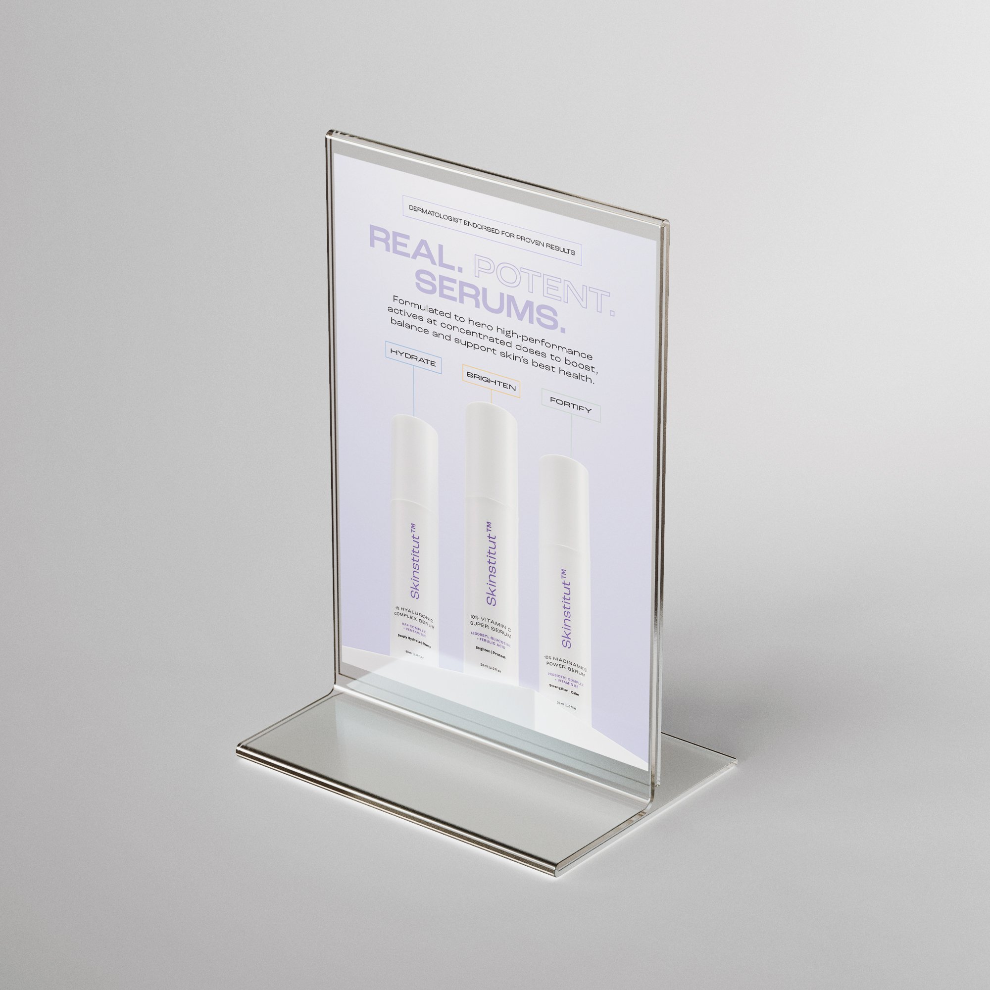
A5 counter cards were displayed at Laser Clinics Australia clinics across the country.
Launch eDM
Open Rate: 34.9%
Click Rate: 1.7%
Placed Order Rate: 0.1%
Total Sales: $3990
Website Banners
Four website banners featured on the Skinstitut homepage carousel to promote the serums. Each product banner features the serum’s hero colours and hero model to clearly emphasise the distinct benefits of each serum.
Social Media
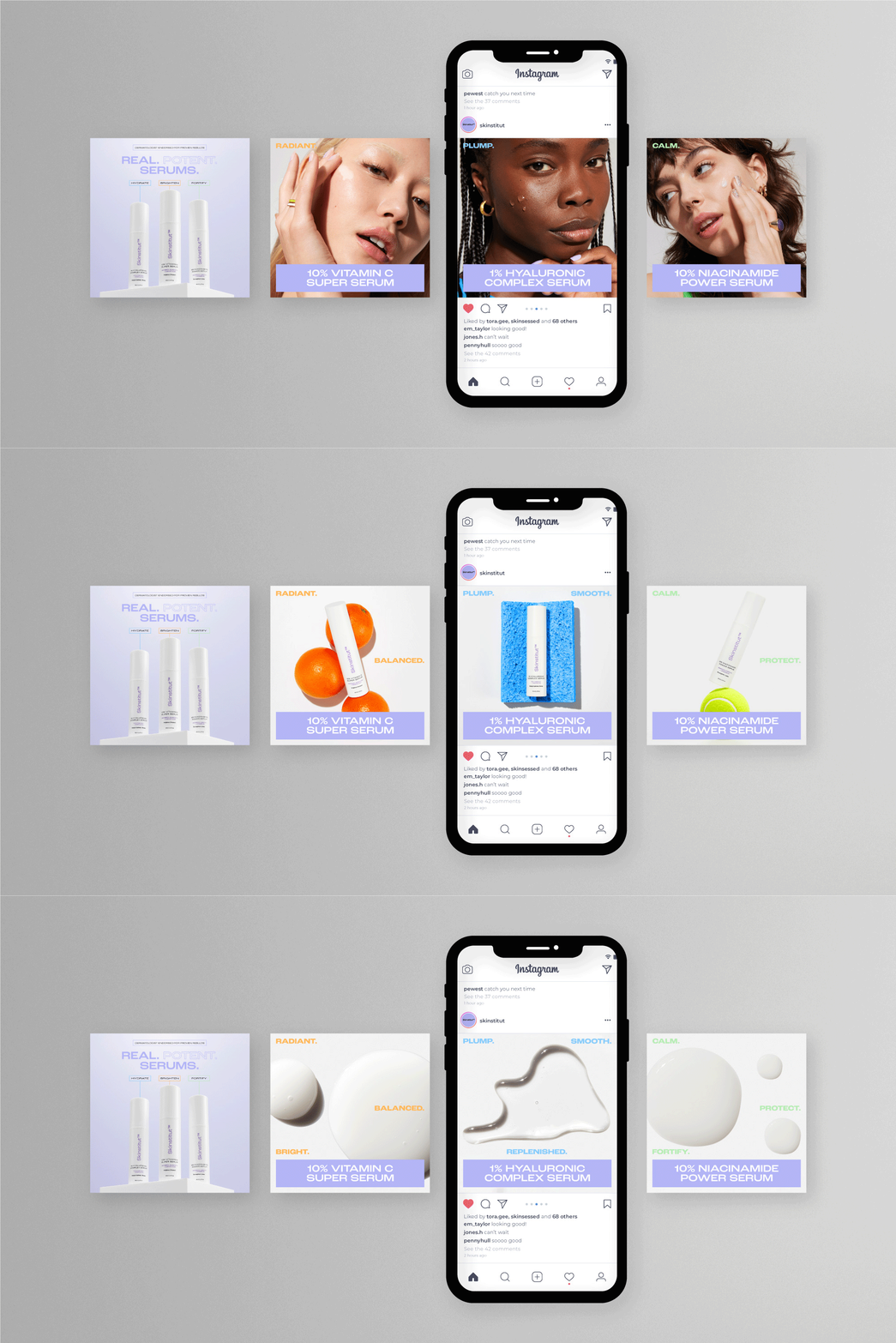
I created a carousel of images for Skinstitut’s social media platforms, incorporating each serum’s fun corresponding still-life photography.
Landing Page
I designed the landing page with two distinct parts. The first half is in Skinstitut’s hero purple colour – reminding the reader of Skinstitut’s authority and grounding the email in familiarity. The second half offers distinct pops of colour for each of the serums, intended to create a sense of excitement and desirability.


